Today's Record High is a website and an app that I wrote to track and display the record high temperatures from major weather stations and cities across the United States. Over the years I've made a few updates to the site to include more charts and graphs. But now, with the help of Claude and agentic engineering, I was able to rewrite the app and add a bunch of new features. These features would have taken me a few weeks to implement on my own, but with the help of AI I was able to get them done over a weekend.
The older version of this website was a .Net Core MVC app that had a single drop down that listed all the weather stations for major cities. After selecting a city the user was brought to a detail page. On that page there were two graphs for the record high temperature then another graph that showed the last 30 days of temperatures compared to the normal temps. This was all well and good, but I really wanted to make this website a place where people could drop in and see how their weather has been changing over the years.
I built this app because I'm really into weather and have always been curious about how today's weather compares to what it used to be like when I was growing up in the 80s and 90s. I feel like the summers are getting hotter and drier in Minneapolis. Building this app is a way to help prove whether my thinking is correct.
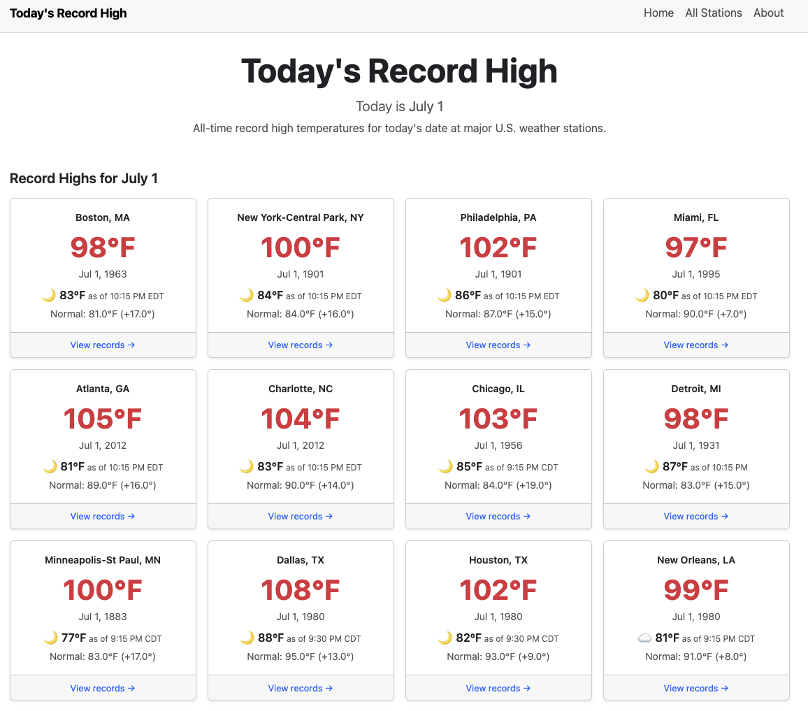
The home page lists a grid of cards for major weather stations across the country. Clicking a card brings up a full dashboard of weather data for that city.
The top section shows the city and the current temperature. If the current temperature is approaching a record, a pop-up appears next to the temp showing exactly how close it is to the record at the last reported reading. That indicator also appears on the home page, so you can see at a glance which cities are heating up that day.
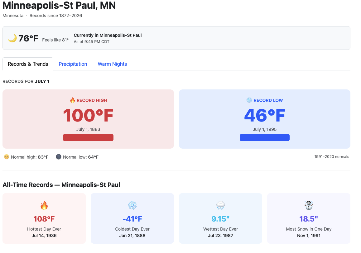
Two large number displays show the record high and record low side by side. The high in big bold red colors and the low in big bold blue colors. Straight away this helps users understand what they're looking at. Those values are followed by a list of all-time records for that day covering temperature, precipitation, and snow.
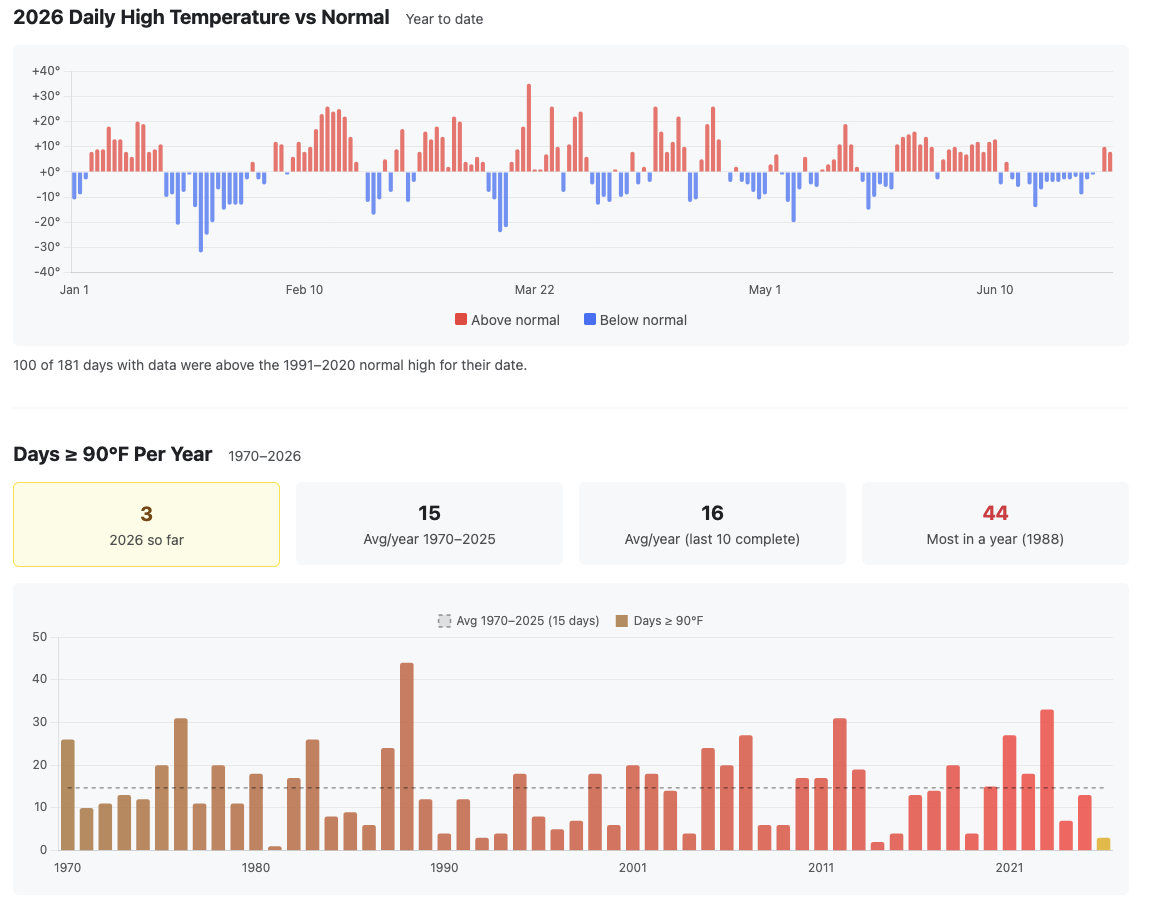
My favorite part of the site is the graph that shows the daily high temp versus normal for the entire year. It's easy to look at a period and instantly spot a heat wave or a cold snap. There's also a table showing the number of days at or above 90°F per year — how many days we've had above 90°F this year versus the historical average.
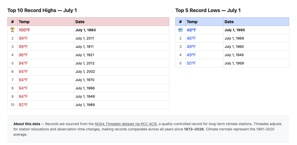
I've also listed the top 10 record highs and record lows for the current day. I like this table because it shows when the hottest years tend to cluster. That said, I don't think a single day of data tells you much on its own. To see whether temperatures are actually changing, you have to dig into full seasons year over year to find a real trend.
The next feature I want to build is a seasonal year-over-year chart showing average temperature — highs and lows — with a trend line. Paired with a full-year view, it should make it clear just how much the seasons or years are warming.
Agentic Engineering at its Finest
I built this entire site by prompting Claude as if I were a client or product manager. I talked over different features that I wanted to have as well as asked for suggestions about what other weather nerds might like to see. The old site was already using endpoints to get the data from the ACIS (Applied Climate Information System, a NOAA data service that powers the website). But the pattern to get data back is a little confusing. So instead of me trying to figure out the patterns of these endpoints, Claude was able to take my product requirements and put them into working .Net code that got data from the ACIS as if it had been working with those endpoints for years.
If I were to research all the endpoints, read the documentation, and manually write all this code, it would have taken a few weeks. That's partly the learning curve but also just the time required. I work full time and have other interests outside of software, so I wouldn't have been able to just crank through it. Working with Claude on this made it possible to get everything done much faster — and it was genuinely fun.
For instance, I had Claude analyze my existing project, and within a few prompts it was rewriting the code and building out something with far more depth than before. I wanted a section showing current rainfall amounts and how they compare to previous years. Working with Claude in Visual Studio Code made it easy to produce an entire tab for this. I just describe what I want, and we iterate until we get to something I like. Here's the prompt that started the precipitation tab:
"I'd like to see precipitation numbers on another tab. I think about things like 'Are we getting more rain than usual?' and 'How does this year/season compare to previous years and seasons?' Think on these topics, plan how to display this information in a modern and simple UI/UX. Return with a plan and we'll go from there."
That produced a full ACIS precipitation integration: YTD, monthly, and summer actuals versus normals, annual totals back to 1970, monthly history for the last 24 months, and heavy rain day counts per year — all across the full model, service, and view layers of the .NET app. AI is scary good.
"Add emojis next to the current weather condition based on the description."
That required mapping Open-Meteo's WMO weather codes to emoji while checking is_day to distinguish ☀️ from 🌙 for clear conditions at night. I didn't know anything about that endpoint or its properties, but Claude built the feature in minutes — implementation details I never had to think about.
These are just two quick examples of how I used Claude to build this version of the app. The first couple of versions I wrote by hand, but for this one I let Claude handle the code while I acted as architect. Normally as an architect I'm reviewing other people's code, not writing it. But here I was directing Claude the way I'd direct a developer and getting the same results.
Combined with AI, I was able to create a product I'd wanted for my own personal use but never had the bandwidth to finish. Beyond the development itself, I also used Claude to audit the site for SEO gaps. It gave me a 4/10 rating and a clear report. The problem turned out to be that the original site loaded all city data via JavaScript, so Googlebot was indexing empty skeleton cards while the data loaded client-side. The fix was parallel Task.WhenAll calls to RCC ACIS in the home controller, so all 18 featured city records land in the initial HTML response. Each individual city page works the same way.
The home page took 30 minutes. The precipitation feature took 45. The full SEO overhaul took under an hour. The prompts were a couple of sentences each — I described in detail what I wanted, and sometimes the results were great right away. Other times I had to go deeper on the specifics to get what I was asking for.
If you've ever wondered whether summers are getting hotter or how much rainfaill is normal for your city, check out Today's Record High and let me know what you find.