Use AI To Visualize Organ Transplant Waitlist Size
This is a blog post to show how using AI to visualize organ transplant waitlist size by compiling data into a readable dataset and viewed in a chart

This blog post shows how to use AI, like ChatGPT, to visualize organ transplant waitlist size by state. At the end of the post I'll have created a data visualization to display the number of candidates that are currently on the organ transplant waitlist for all organs ordered from highest to lowest using ChatGPT.
This data from this blog post and report shows OPTN data for Waitlist : Count, Organ by Waiting Time, State of Center through December 7, 2023. OPTN Data is updated on a monthly basis.
Normally, there are two routes I'd take to get this data into a chart. The first would be the reusable method of taking the raw data set, manipulate it into a more simple format, load the data into a database, write an API then write a HighCharts front end to display the data. The other would be to use a tool like everviz, or Tableau if the data was a one off and I didn't want to reuse it again for other similar data sets.
This time I just wanted to throw the data at AI to see what would happen and if it would be less or more work to get the data into a visualization.
Using the OPTN - Build advanced tool, I generated table showing what the current number of registrations and candidates are on organ transplant waitlists for each state in the United States (As of December 7th 2023). My goal is to tell which states had the most candidates on their respective organ transplant waitlists. This information is available using the OPTN tool, however the output is difficult to consumer and compare as it's multiple large tables stacked on top of each other and the results are alphabetical without any ability to sort the results. Putting the data into a chart would be more clear to end users who are using the data.
I downloaded the full results and I asked ChatGPT to create a visualization of the current number of registrations and candidates on the waitlist for each state ordered by highest to lowest. Here's how I used AI to visualize organ transplant waitlist size in the United States.
My first attempt was to upload the entire downloaded report right into ChatGPT to see if the system could figure out the visualizations without much of a prompt. ChatGPT wasn't able to break apart the data and process it as you can see from the prompt history below:
Input: Attached is the OPTN waitlist registration data. This is a csv file that is a representation of the organ transplant waitlist: Count, Organ by Waiting Time, State of Center. Analyze this data and create data visualizations that would be attractive for transplant researchers to consume.
Output: The CSV file contains data about organ transplant waitlist registrations, segmented by state and organ type. The data columns include counts for different organs and combinations like kidney, liver, heart, etc. However, the column names and structure appear somewhat complex, with multiple unnamed columns and possibly merged cells.
To proceed effectively, I'll reorganize and clean this data, focusing on key columns such as 'State of Center', 'Organ', and 'Count'. This will help create clear and insightful visualizations. Once the data is structured properly, I can generate visualizations like bar charts or heatmaps that are useful for transplant researchers.
Let's start by cleaning and restructuring the data.
It seems there was an error in the data cleaning process. The issue might be related to the handling of state names and the conversion of string counts to integers. I'll revise the approach to ensure the data is cleaned and restructured correctly. Let's try again.
The error persists, indicating a problem with the way I'm trying to convert string counts to numeric values. The issue might be with the data format or the columns selected for conversion. To resolve this, I will inspect the data types of each column to better understand their structure and then apply the appropriate conversion method. Let's examine the data types first.
The data types reveal that most of the count columns are of object type, likely containing strings, and some are of float64 type. The error occurred because I attempted to apply string manipulation functions to columns that are already in float format.
To address this, I'll separate the columns into two groups based on their data types: those that are objects (strings) and those that are floats. Then, I'll convert the string columns to numeric values correctly. Let's proceed with this approach.
The data has been successfully converted to numeric values, but it appears that the initial assumptions about the structure of the data may not have been accurate. Specifically, the columns that were expected to represent the 'State' and 'Time Period' are actually numeric (or empty), indicating a misinterpretation of the data structure.
To proceed effectively, it would be helpful to re-evaluate the dataset, focusing on understanding the correct representation of states and organs. This might involve re-examining the original CSV structure or considering alternative approaches to interpret the data.
Would you be able to provide more context or clarification on the structure of the CSV file? Specifically, how the states and organ types are represented in the data? This information would greatly assist in accurately analyzing and visualizing the data.
This was a pretty hopeful experiment and with minimal prompting ChatGPT didn't know how to parse out this large file. With more prompting and hand-holding I think I could have gotten the system to generate a visualization I wanted, working with AI systems is a process to get where we want to go.
On the next prompt I updated the file by removing the time frame breakdown and fixed the headers that were not exported to the CSV correctly and tried again. I also gave more direction of what was contained inside the file to help ChatGPT parse the file.
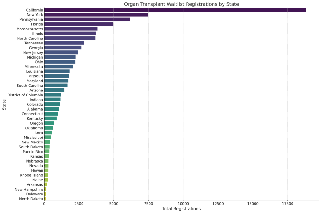
Input: Try this again. Attached is a spreadsheet which lists the states in the first column followed by the number of registrations per organ then candidates per organ in the following columns. Create a data visualization chart that will display that states with the highest waitlist going down to the lowest number on the waitlists.

Output: The bar chart above visualizes the organ transplant waitlist registrations by state, highlighting states with the highest number of registrations. Each bar represents a state, with the length of the bar indicating the total number of registrations in that state. The states are arranged in descending order of their total registrations, providing a clear view of the states with the highest waitlist counts down to those with lower numbers. This visualization should be useful for transplant researchers to easily identify and compare the waitlist sizes across different states.
This time I got results that were much better. Putting the data in a simpler format along with some more context really helped the system understand what the data was and how to come to the outcome that I was looking for. Next, let's see this by candidates:
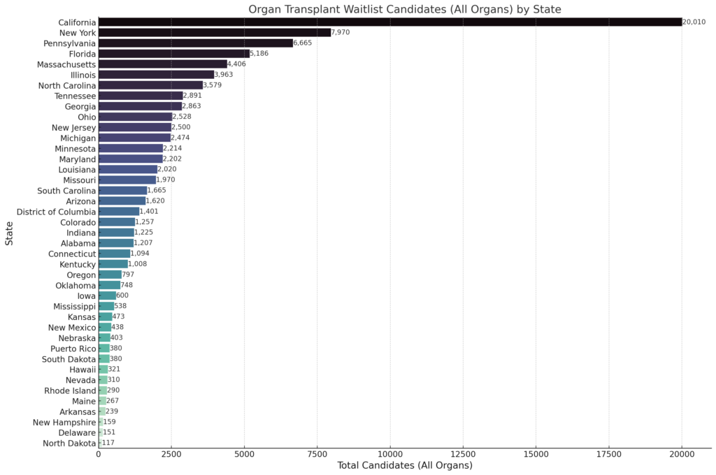
Input: Do this again for candidates instead of registrations

Output: The bar chart now visualizes the number of candidates on the organ transplant waitlist by state. Similar to the previous chart, each bar represents a state, with the length of the bar indicating the total number of candidates in that state. The states are arranged in descending order of their total candidates, making it easy to see which states have the highest number of candidates waiting for organ transplants. This visualization provides a clear comparison of the candidate numbers across different states, which can be particularly insightful for transplant researchers.
This actually looks pretty good, but I know North Dakota has 117 records in this particular file but the chart looks like there isn't a value. To be sure what the count was for each state, I prompted ChatGTP to show the results for each state at the end of the bar.
Input: Put the number of candidates at the top of the bar to indicate the number and make it easy to see
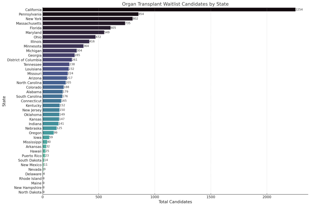
Output: The updated bar chart now includes the number of candidates at the top of each bar, making it easier to see the exact count for each state. This enhancement provides a clear and immediate understanding of the candidate numbers on the organ transplant waitlist for each state, facilitating quick comparison and analysis for transplant researchers.
Yep, confirmed that the data is not correct. I didn't dig into which columns or data was being returned but I did ask ChatGPT the question.
Input: Are you using "Candidate" "All Organs"? The data represented in the chart does not match the spreadsheet
The system returned the updated chart below. This was pretty amazing given I didn't prompt the system much but it was enough that the error was corrected and the correct data was returned.

Output: The revised bar chart now accurately represents the number of candidates for all organ transplants by state. This visualization uses the "Candidates" column, which aggregates the total candidates for all organs across each state. The numbers at the top of each bar indicate the exact count of candidates, offering a clear and precise view of the waitlist situation in each state. This should align more closely with the data in your spreadsheet and provide the information you need for analysis.
Awesome, now just update the numeric formatting and I think it's good to go.
Input: Looks better. Include numeric formatting for numbers over 999

What's even cooler about this process it that each time ChatGPT creates a chart image, it also gives you the code the system used to create the chart. Here is an example of the Python code used to create the final image. You'd need to know Python and what dependent libraries to use to implement this into a fully functioning program, but this is a great start.
# Creating the bar chart for candidates with numeric formatting for numbers over 999

plt.figure(figsize=(15, 10))
barplot_formatted = sns.barplot(x='Candidates', y='State', data=sorted_by_candidates_all_organs, palette="mako")

# Adding the number of candidates with numeric formatting at the top of each bar
for p in barplot_formatted.patches:
    width = p.get_width()    # Get the width of the bar
    label = f'{int(width):,}'  # The label text with numeric formatting
    plt.text(p.get_width(), p.get_y() + p.get_height() / 2, label, va='center')

plt.title('Organ Transplant Waitlist Candidates (All Organs) by State', fontsize=16)
plt.xlabel('Total Candidates (All Organs)', fontsize=14)
plt.ylabel('State', fontsize=14)
plt.xticks(fontsize=12)
plt.yticks(fontsize=12)
plt.tight_layout()

# Display the plot
plt.show()
In the end this entire process took about 10 minutes and delivered the graphic that I was looking for, which is pretty impressive if all you have is a spreadsheet and need to output a graphic. It's not a beautiful interactive design, but it's an informative data set that can be used on the fly without the need for a development staff to create.
There are a few downsides to this method, like we only see a graphic, there is no interactivity available to the end user and to modify the display a new image needs to be generated. To achieve that we'd need to wire the data up to a interactive charting library like HighCharts or D3. But this example shows the power AI has to be a valuable tool for healthcare staff and researchers without a deep technical bench.