When will healthcare catch up with AI
I see is people asking is when will healthcare will catch up with AI. The idea being that healthcare is lagging behind the technology advancements in AI.

In my LinkedIn feed, I'm connected to a lot of people in the medical field - doctors, transplant surgeons, med tech startup people and all kinds of researchers. A common post I see is people asking is when will healthcare will catch up with AI. The idea being that healthcare is lagging behind the technology advancements in AI.
I don't have a solid footing for an opinion either way, but I don't think that it is. If you look around the healthcare startup world you will see so many new AI startups in the industry. There are more hurdles for a healthcare start up than there would be in say, the e-commerce space, which I'll talk about later. I also think that it takes some time between when a new AI system is released to the public and when users start to notice them. I'm specifically talking about the leaps we've seen in ChatGPT and it seems overnight everyone was using it or at least aware.
Just seeing the comments on my LinkedIn feed got me thinking about what I could do right now to use AI in healthcare. I thought about my work as a consultant in healthcare technology and came up with problems that I know many of my clients have faced. The thing that popped into my head was turning CSV data into data visualizations. A lot of times we work with clients who have a significant amount of data but either don't have the development staff to do anything or are inexperienced in data visualizations and/or data process. Without a development staff or experience, it can be pretty daunting to try to sift through all the data to make sense out of it. That's where I love to come in to help organizations. We've done it so many times that we essentially have built a product for this very thing.
From start to finish, this is what I normally do when building a system for a healthcare client who wants to see their data in a data visualization.
- Identity the source of the data. This is usually a database or collection of Excel or CSV files that have been created by a statistician or data analyst.
- Create a centralized database to house the data and allow programs to access the database. Write a program that will continually populate the data when new data is created.
- Create an API layer that can deliver the data to a web front end like React or Vue.
- Create a web front end like React or Vue that includes a charting library like HighCharts, D3 or Anychart.
- Work with a designer to create the design and layout of the charts to be displayed.
- Sit together with the business to flesh out the details of what the charts are going to display and what data is going to be available on the website. This can take a good amount of time if the client has some really cool data that we want to display.
That's a high level overview of how we normally build a system to process data from the raw output into a visually appealing graph or chart. Now what got me going today was the idea that a non technical person could open Chat-GPT, upload a raw data set and with a few back and forth commands they could end up with a nicely done visualization summary of the data set.
This morning I took a CSV file from the OPTN transplant reports section of HRSA.gov that had transplants by donor type between 1988-today (2024), uploaded it to ChatGPT and told it what to produce. Here are my prompts that I used:
I'm going to provide a csv file that shows the Transplants by Donor Type for 1988-2024 in the state of Minnesota. For each donor type, write me a data visualization that orders the data by the highest to lowest.
Transplants by Donor Type
U.S. Transplants Performed : January 1, 1988 - February 29, 2024
For State = Minnesota
---
From there I asked GPT to make a few updates that directed where I wanted the chart to go. They were like to include text about each of the donor types and their trends, change the direction of the data set, use only these columns and some other formatting direction prompts. Here is the output that I ended with.
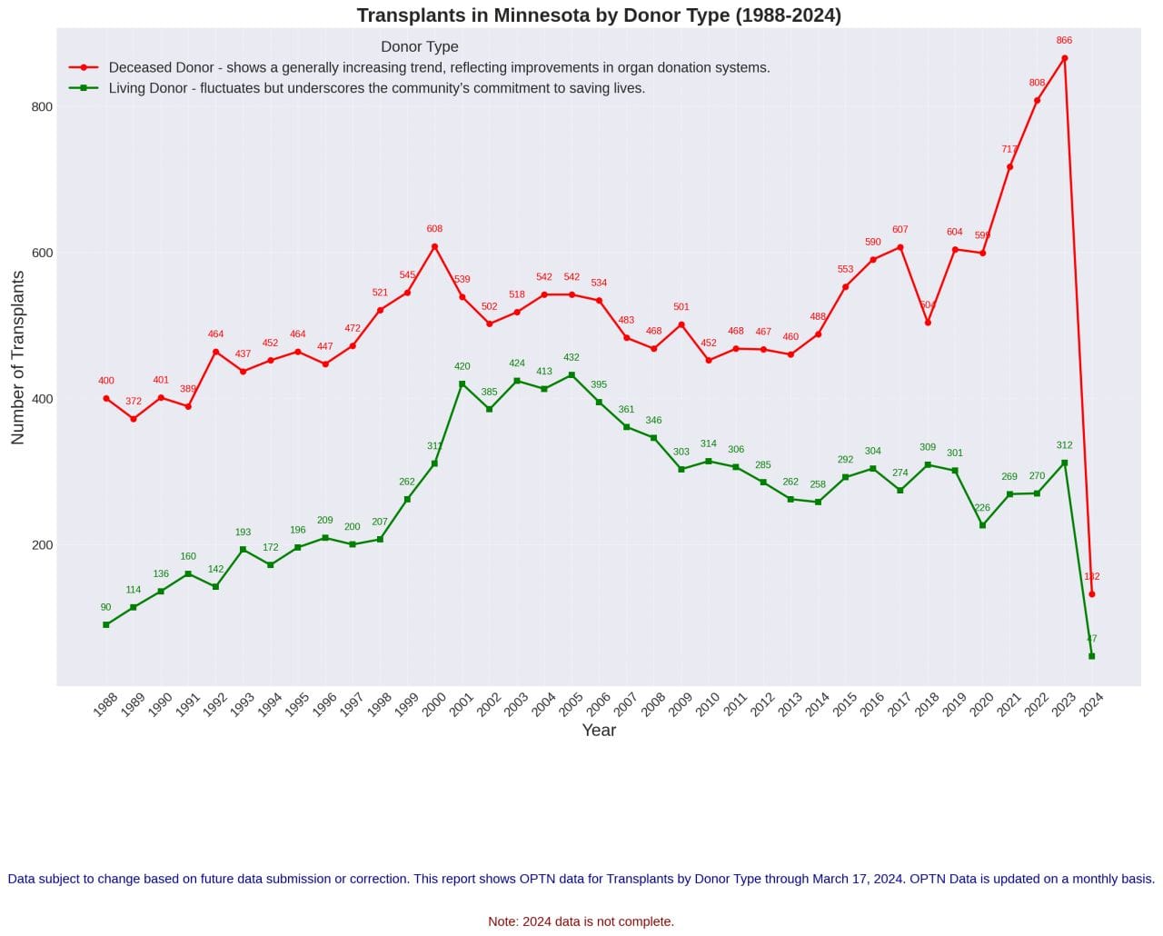
It's not a very good looking chart, but it's a chart that was created without any need for a database, API, front end or charting library. It was created soley by telling the AI system to create this chart. If you use your imagination you can see how far and how detailed this chart could come. It wasn't magic and it definitely took work to create the chart, but it's a different kind of work that I can see putting into the hands of medical researchers in the future to allow them to create their own charts.
This took me about 10 minutes to create with a lot design updates that would need to be done before this was a published piece. But with more practice the chart could turn out to be a pretty decent chart that could be used for whatever the end user had in mind. It's a big jump from where we were just a few years ago where something like this wasn't really possible yet.
All in all, it's pretty exciting to see what can of data you can pull in such a short amount of time.